ShopDreamUp AI ArtDreamUp

Deviation Actions
AI art: background views
the default size is 512 to 1024, but all images are being resized.✅without deviantart_watermark+ upload verious size 2048/3072/4096+anything theme of view BG✅But please note that my initials are in it.
$8/month


Suggested Deviants


Suggested Collections


You Might Like…


Description
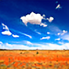
First of all a big thanks goes to  for the premium membership! How awesome is she?!
Now the image... I had a request a while ago for something that must contain a lot of warm/red colours. I revisited my outback images and really liked this one but the sky was too cool so a separate image was used here for the top half. I don't usually do this (fake skies) but thought it came out cool so here it is")
Original image:

For more updates on my work follow me on facebook
I'm also on 500px
_____________________
All rights reserved. This may not be used or reproduced in any way.
© Cain Pascoe.
for the premium membership! How awesome is she?!Now the image... I had a request a while ago for something that must contain a lot of warm/red colours. I revisited my outback images and really liked this one but the sky was too cool so a separate image was used here for the top half. I don't usually do this (fake skies) but thought it came out cool so here it is
Original image:
For more updates on my work follow me on facebook
I'm also on 500px
_____________________
All rights reserved. This may not be used or reproduced in any way.
© Cain Pascoe.
Image size
1000x667px 1.2 MB
© 2013 - 2024 CainPascoe
Comments33
Join the community to add your comment. Already a deviant? Log In
I have carefully studied both pictures now and I hope to write a helpful critique.
First I will compare the two images, before I go on to the content of the image:
I agree that the cold sky on the previous version has a quite different impact from this work. I prefer this version as the colours are much more harmonical, they fit perfectly together.
I must admit that the fake-sky looks very realistic - if you had not mentioned it, I would not have realized that it is faked. Nevertheless you could have taken more time for this postwork; When I look at the horizon I can see a blue hue that must be a relikt from the previous version. You could easily remove that hue by bluring the colours in this area or overpainting it with a tone similar to the new sky <img src="e.deviantart.net/emoticons/s/s…" width="15" height="15" alt="
(I would also suggest to remove that "black object" in the foreground again, as mentioned in the previous image's critique)
Now about the image itself:
I like the symmetry of the composition very much. The dead bush in the foreground as a typical composition's element works very well - its black and white structure/colour adds an interesting contrast to the colourful rest of the image. It also increases the impression of heat that we can find in such a deserted area. Moreover it creates something like a contrast to the rock because of it's sharp and angular shape. Maybe it is even more interesting to me than the rock in the background - no idea if that is good or bad - but for sure it adds to the whole impression.
The amount of bushes creates a good depth and I like how they change from "single bushes" into "fields of bushes" - if you understand what I mean.
I think that it is quite interesting that the colour of the ground is the same like the rock in the background. Of course, this is natural and not really surprising, but as we don't have such constellations all over the world, it is still a good point to be considered.
The slight vignetting helps to focus on the main subjects of the image.
At least I would like to say something about landscape photography in general:
I am sure you have seen such a composition several times before you used it on your own and I see no problem in the composition, it works very well! I just think that many modern artist are producing very similar works, especially when it comes to landscape/waterscape photography. Everyone loves these images, but at some point I must admit that they are loosing their impact on me. I am sure this is due to the teaching of photography in schools in australia or elsewhere in the world or due to orientation towards the professionals of our time. Here in Germany you can be happy when you deal with photography maybe for about 2 hours in your art classes - in my personal case it was less than that.
I hope for the modern artists that they are experimentating more and more - daring more extreme, rare compositions, perspectives, angles and weather conditions. I did not say any word about the technical quality as we have certain standarts here and most landscape photographers are cherishing these rules of sharpness, using a tripod (if necessary) and 2/3 horizons and all that we all know very well.
I would encourage you to leave these certain standarts to some degree, I am sure your works will become more outstanding, more interesting, more inspirational than they already are! <img src="e.deviantart.net/emoticons/s/s…" width="15" height="15" alt="